
Most advice on this topic stops at two steps: compress your images, convert them to WebP. Both are correct and neither is where the actual damage is.
According to the 2025 Web Almanac, an image is the Largest Contentful Paint element on roughly 85% of desktop pages and 76% of mobile pages. That means on most pages, one image decides your loading score. And the single most common mistake people make is applying a performance technique to that image which makes it measurably worse.
So this covers the compression, but it spends more time on the part nobody writes about: which image matters, and what you should be doing differently to it.
Resizing Before Anything Else
Compression gets all the attention. Resizing saves more.
A photo straight off a phone is around 4000 pixels wide. The content area of a blog is typically 700 to 900 pixels. Serving the first where the second is needed wastes roughly 95% of the bytes, and no amount of clever compression recovers that.
Sensible starting widths:
| Use | Width |
|---|---|
| Featured image | 1200 to 1600 px |
| In-article screenshot or photo | 1024 px |
| Half-width or inline image | 600 px |
| Author photo, icon, logo | 200 px or less |
Those are wider than your content area on purpose, so images stay sharp on high-density phone screens. Doubling the display width is enough. Quadrupling it is waste.
If you’re on WordPress there’s a behaviour worth knowing here. Since version 5.3, anything you upload wider than 2560 pixels gets scaled down automatically, and the file that actually gets served has -scaled added to its name. Your original is kept but no longer used. This surprises people who upload a 4000 pixel image, check the media library, and find a filename they didn’t create.
That’s a safety net, not a strategy. 2560 pixels is still far wider than any blog needs.
Choosing a Format That Isn’t WebP
Every guide on this subject recommends WebP. That advice was right in 2020 and it’s now one step behind.
| Format | Size vs JPEG | Browser support |
|---|---|---|
| JPEG | Baseline | Everything |
| WebP | 25 to 35% smaller | About 96% |
| AVIF | Around 50% smaller | About 95% |
AVIF is roughly 30 to 50% smaller than WebP at equivalent quality, and support has caught up to within a percentage point. WordPress has handled AVIF natively since version 6.5, released in April 2024, and AVIF images get responsive sizes, fetch priority and lazy loading exactly like any other format.
Two honest caveats before you convert everything.
AVIF is slow to encode. Noticeably slower than WebP. If you’re converting in bulk, expect to wait.
Small images barely benefit. The median image on the web is around 12 KB, where a 40% saving is a few kilobytes and not worth the effort. AVIF earns its keep on large images, which in practice means your featured image and any full-width screenshots. Icons and small graphics can stay as they are.
Also check with your host before relying on it. WordPress needs a reasonably current ImageMagick with AVIF libraries to generate the sized versions, and older shared hosting sometimes doesn’t have it.
PNG still has one job: graphics with sharp edges and flat colour where you need transparency, like a logo. Never use it for photographs.
Compressing Without Wrecking It
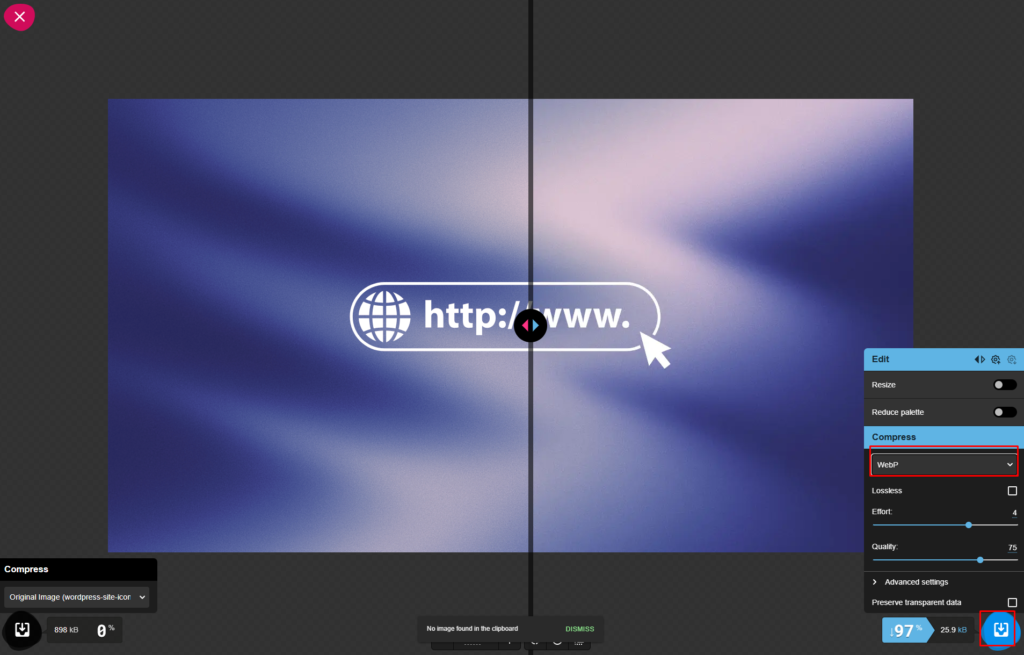
Squoosh does this in the browser with a slider and a live preview, which is the fastest way to find the point where quality starts to visibly go.
For photographs, quality 75 to 85 is the useful range. Below 70 you start seeing blocky artefacts in skies and gradients. Above 90 you’re adding file size that nobody can perceive.
Screenshots behave differently and this catches people out. A screenshot of a dashboard is mostly flat colour with thin text, and lossy compression attacks exactly that: the text gets a faint halo and small labels turn to mush. Push screenshots higher, around 85 to 90, or keep them as PNG if the interface is mostly white with fine lines.
A reasonable target for a full-width in-article image is under 150 KB. Under 100 KB is better. If a single screenshot is 800 KB, something has gone wrong upstream, and it’s almost always that it was never resized.
One thing worth doing while you’re here: strip the metadata. A photo from a phone carries camera settings, timestamps and sometimes GPS coordinates. That’s a few kilobytes and, if you photographed something at home, a privacy problem you didn’t intend to publish.
The One Image That Decides Your Score
This is the part the other guides skip, and it matters more than everything above.
Largest Contentful Paint measures how long it takes for the biggest visible element to appear. On most blog posts that element is your featured image, and its loading time is your LCP score.
Which makes lazy loading, the technique every performance guide tells you to switch on, actively harmful when applied to that particular image.
Lazy loading tells the browser to wait until an image is nearly on screen before fetching it. Brilliant for the twelve images further down your article that most readers never scroll to. Applied to the image at the top, it introduces a deliberate delay before the browser even starts downloading the thing your entire score is measured on.
The numbers are stark. According to data published on web.dev, lazy-loading the LCP image drops the share of pages with a good LCP score from 79% to 52%.
The rule is simple enough to remember:
| Image position | Attribute |
|---|---|
| Visible without scrolling | No lazy loading. Load it eagerly. |
| The largest one of those | Add fetchpriority=”high” |
| Everything below the fold | loading=”lazy” |
That fetchpriority attribute is worth understanding. It tells the browser to start downloading this image immediately, before it has even worked out the page layout. Google’s own testing found it cut LCP from 2.6 seconds to 1.9 seconds on a single image.
Use it on exactly one image per page. Mark five images as high priority and the browser has nothing left to deprioritise, which defeats the entire mechanism.
What WordPress Already Does For You
Some good news before you go editing anything by hand.
WordPress has added loading="lazy" automatically since version 5.5. Since 5.9 it has tried to skip the images at the top of the page, and version 6.3 fixed the remaining cases and added automatic fetchpriority="high" to whichever image it judges to be the LCP element.
It also generates several sizes of every image and writes a srcset so phones download a smaller file than desktops, and it adds width and height attributes to every image tag.
Those width and height attributes deserve a note. They’re what lets the browser reserve the right amount of space before the image arrives. Without them, text jumps down the page the moment each image loads, which is Cumulative Layout Shift, and missing dimensions is by far its most common cause.
The catch is that core’s LCP detection is a guess. It picks the first image that isn’t lazy-loaded and is larger than 50,000 square pixels. Themes and page builders that render images their own way can defeat it entirely. So verify rather than assume.
Open your article, right-click, choose View page source, and search for fetchpriority.
You want to see it once, on your featured image, and you want that same image to have no loading="lazy". If your top image is lazy-loaded, that’s the single most valuable fix available to you, and it’s worth more than every compression tweak in this article put together.
On Blogger you have less help and more control. Nothing is added automatically, so you write the attributes yourself in HTML view, which at least means nothing is fighting you.
Writing Alt Text That Does Something
Alt text has two jobs and keyword stuffing serves neither.
It’s what a screen reader announces to someone who can’t see the image, and it’s the main thing Google reads to understand what an image contains. Both want the same thing: a plain description of what’s actually there.
| Don’t | Do |
|---|---|
| image1.jpg | Cloudflare SSL settings page with Full strict selected |
| seo wordpress tips wordpress seo | WordPress Site Health page showing an HTTPS warning |
| photo | Flat lay of a laptop and notebook on a wooden desk |
If your keyword genuinely describes the image, it belongs there. If you’re bending the description to fit it in, you’ve made the text worse for a screen reader and no better for Google.
Purely decorative images, the stock photo of a laptop that illustrates nothing, should have an empty alt attribute rather than a description. That tells a screen reader to skip it instead of reading out something meaningless.
Filenames matter too, and they’re free. cloudflare-ssl-full-strict.png tells Google something. IMG_20260810_141523.jpg tells it nothing. Rename before uploading, because renaming afterwards means every link to that file breaks.
Finding Out What’s Actually Slow
Guessing is optional. Run one of your article URLs, not your homepage, through PageSpeed Insights.
Three things to look at, and ignore the overall score.
The LCP element. The report names it. If it’s an image, that image is your whole loading score and everything else is secondary.
Properly size images. This flags images being served larger than they’re displayed, with the exact saving in kilobytes. It’s the resizing problem, and it’s usually the biggest number on the page.
Serve images in next-gen formats. Your JPEGs and PNGs, with what AVIF or WebP would save on each one.
Use the mobile tab. That’s what most of your readers are on and it’s what Google measures. And run the same URL a few times, because the lab score moves around and one bad run means nothing.
If images turn out not to be your problem, the rest of the picture is in why your WordPress site is slow.
Do You Need a Plugin
Most guides on this topic answer with a list of five and an affiliate link. The honest answer depends on how many images you already have.
Starting out or publishing a few posts a month: no. Resize and compress before uploading and you’ve done everything a plugin would do, without adding code that runs on every page load. Ten seconds per image in Squoosh.
Hundreds of unoptimised images already uploaded: yes, for the bulk conversion. A plugin will process the backlog in one run, which by hand is a weekend.
Multiple authors uploading straight from phones: yes, as a safety net for the images nobody remembers to prepare.
Whatever you choose, don’t stack them. Two optimisation plugins fighting over the same media library produces conflicts that are genuinely unpleasant to unpick, and it’s a specific case of a broader problem covered in speeding up WordPress without plugins.
Common Mistakes
Lazy loading everything. The featured image must not be lazy-loaded. This one mistake costs more than every other item here combined.
Compressing without resizing. Squeezing a 4000 pixel image to 200 KB still ships a 4000 pixel image. The browser downloads all of it and then throws most of it away.
Screenshots compressed like photographs. Text goes fuzzy at settings that photographs survive comfortably.
fetchpriority on several images. One per page. More is the same as none.
Missing width and height. Your layout jumps as each image lands, and that’s a Core Web Vitals failure with a very easy fix.
Chasing a score of 100. Nobody needs it. Get LCP under 2.5 seconds on mobile and stop. The hours after that are better spent writing.
The Short Version
Resize to the width you’ll actually display. Export as AVIF, or WebP if your setup can’t manage it, at quality 80 or so, higher for screenshots. Name the file something descriptive and write alt text that describes the picture.
Then check one thing: view the source of your published article and confirm the featured image has fetchpriority="high" and no loading="lazy".
That last check takes thirty seconds and, on most blogs, is worth more than everything above it.