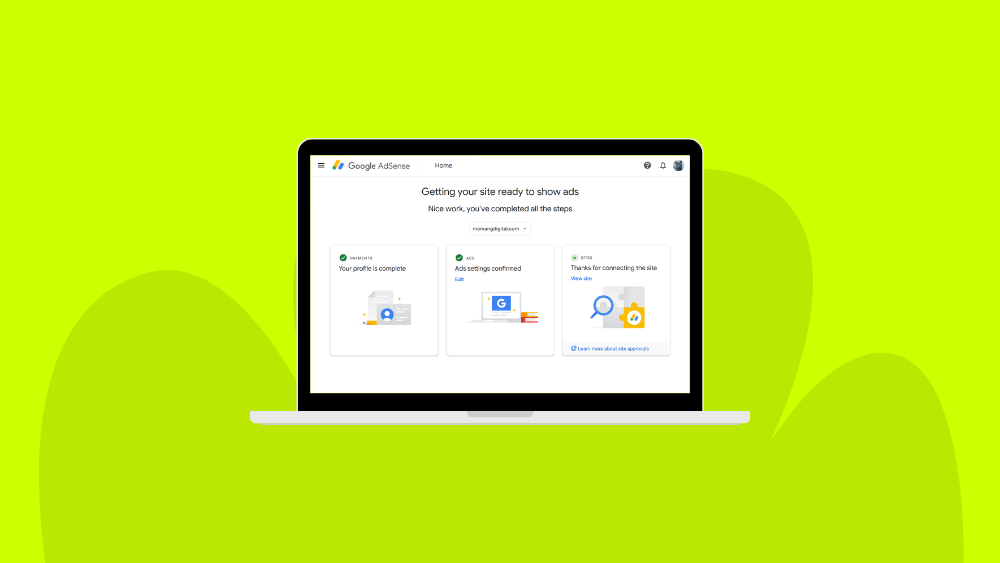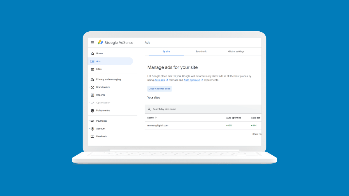

Your AdSense application just got approved, and now you face a new question nobody warned you about: where do the ads actually go? Put them in the wrong places and you either annoy your readers into leaving, or you leave real money on the table by hiding ads where nobody looks. Both mistakes are more common than you would think.
If you have not registered for AdSense yet, our guide on how to register for Google AdSense covers that first step. This guide picks up right after approval, walking through where ads genuinely perform well, where they backfire, and how to strike a balance that keeps both your earnings and your readers intact.
The Trap Almost Every Beginner Falls Into

Here is the pattern that plays out again and again. A new publisher gets approved, feels excited, and adds ads everywhere: top, sidebar, between every paragraph, bottom. Traffic drops, readers bounce faster, and ironically, earnings often fall too, because fewer people stick around long enough to see any ad at all.
More ads is not the same as more revenue. What actually drives earnings is a mix of how many people see your ads, how long they stay on the page, and how relevant the ads feel in context. A cluttered page that drives people away loses on all three. The goal from the start should be a small number of well-placed ads, not the maximum you can fit.
Auto Ads vs Manual Placement: An Honest Comparison
When you set up AdSense, you will meet a feature called Auto ads, which uses Google’s own system to decide where and how many ads to insert automatically. It sounds convenient, and for a total beginner it is a reasonable starting point, since it requires no design decisions at all.
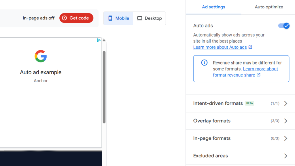
The honest catch is that Auto ads, left on default settings, can be more aggressive than you would choose yourself, sometimes inserting more ads than a page comfortably holds. If you use it, go into your AdSense settings and adjust the ad load and formats rather than accepting the defaults blindly. Many experienced publishers land on a hybrid approach: they manually place ads in the positions they know perform well, and let Auto ads fill in modest extra space around that. That hybrid approach gives you control over the spots that matter most while saving you from having to design every placement yourself.
The Positions That Actually Perform Well
Across publishers and years of testing, a handful of positions consistently perform better than the rest, because they sit where reading attention naturally lands.
An ad placed just before or right after your first paragraph tends to perform strongly, since it sits where every reader’s eyes pass, without blocking the opening that convinces them to keep reading. An ad placed within the body, often after a couple of paragraphs into a longer post, catches readers who are already engaged, which tends to mean higher quality attention than an ad seen for half a second before someone scrolls past. For longer guides, breaking up major sections with an ad between them works well without feeling intrusive.
An ad near the end of your content reaches your most engaged readers, the ones who finished the whole article, and these late-article positions often see stronger engagement even with fewer impressions overall. On desktop, a sidebar ad that stays visible as someone scrolls can perform steadily for informational content, though this only applies where your layout has a real sidebar and only matters for desktop visitors.
What ties these together is that each sits somewhere a reader’s attention is already going, rather than forcing attention toward the ad itself.
Mobile Matters More Than Desktop
For most blogs today, the majority of traffic arrives on a phone, which means your mobile layout deserves more attention than your desktop one, not less. A placement that looks fine on a wide desktop screen can feel like it takes over the entire visible area on a small phone screen.
Google offers mobile-specific formats like anchor ads, which stick to the bottom of the screen, and vignette ads, which show briefly between page loads. Used sparingly, they can add revenue without much disruption. Used aggressively, or stacked with other ad units, they frustrate exactly the majority of your visitors. Whatever placements you choose, actually open your site on a real phone and scroll through it as a reader would. If an ad ever blocks you from easily reaching your next sentence, it needs to move.
What to Avoid, Because It Costs You Twice
A few placement mistakes are worth calling out directly, because they hurt you in two ways at once: readers leave, and you risk your AdSense account itself.
Never let an ad cover or overlap your actual content, even partially, since this is both a poor experience and a direct policy violation that risks your account. Avoid placing so many ads that the page feels like it is mostly advertising with content squeezed in between, which damages trust and is another pattern Google’s policies specifically discourage. Be careful with ads placed so close to navigation or buttons that readers might click an ad by accident while trying to use your site, since accidental clicks are a policy risk, not a revenue win. And resist the urge to stack multiple mobile ad formats (anchor plus vignette plus in-content) all on the same page, since together they can overwhelm a small screen fast.
None of these mistakes require malice, they usually come from excitement after approval. Slowing down and reviewing your site as a visitor would catches nearly all of them.
Why Fewer, Better Ads Usually Win
It feels counterintuitive, but publishers consistently find that a handful of well-placed ads earns comparably to, and often better than, a page crammed with them. The reasoning connects back to the same three ingredients: viewability, time on page, and relevance. A clean page keeps people reading longer, which means more ads actually get seen over the course of a visit, and a good experience keeps readers coming back, compounding over time in a way one cluttered visit never does.
There is also a technical link worth knowing: extra ad scripts can slow your page down, and slower pages both frustrate readers and can affect your search visibility. If you have not looked at your site’s speed recently, our guide on speeding up WordPress without a plugin is worth pairing with your ad setup, since a fast, clean site and a smart ad layout support each other rather than competing.
A Simple Starting Setup for Beginners
If all of this feels like a lot to decide at once, here is a sensible starting point rather than a rule to follow forever. Place one ad after your first paragraph, one within the body of longer posts, and one near the end of the content. Turn on Auto ads but adjust the ad load down from the default rather than leaving it at maximum. Check how it all looks on an actual phone before you consider yourself done.
From there, watch your AdSense reports over a few weeks rather than judging after a single day, and adjust gradually. Small, deliberate changes based on real data will always beat guessing, and they will keep you comfortably inside AdSense’s policies while your site and your income grow together.
Frequently Asked Questions
How many ads should I put on one page?
Google does not set a fixed limit, but fewer, well-placed ads consistently outperform a cluttered page. A reasonable starting point for a blog post is around two to three ads: one near the top, one within the body for longer content, and one near the end.
Should I use Auto ads or place ads manually?
Auto ads are a reasonable starting point for beginners since they require no design work, but left on default settings they can be more aggressive than ideal. Many publishers use a hybrid approach: manually placing ads in known strong positions and letting Auto ads fill modest extra space around them.
Where is the single best place to put an ad on a blog post?
An ad placed just after the first paragraph tends to perform strongly across most blogs, since every reader passes it without it blocking the opening that hooks them. For longer posts, adding a second ad within the body and one near the end often adds further value without overwhelming the page.
Can bad ad placement get my AdSense account suspended?
Yes, in serious cases. Ads that cover content, pages dominated by advertising rather than content, or layouts that cause accidental clicks all violate AdSense policy and put your account at risk, separate from simply being a poor experience. Reviewing your site as a visitor regularly helps catch these before they become a problem.
Do ads slow down my website?
They can, since every ad adds a small amount of loading work to your page, and stacking many ad units compounds that effect. Keeping your ad count reasonable and your site otherwise well optimized helps limit the impact on speed, which matters for both readers and search visibility.