Blogger’s post editor has no table button. There’s no toolbar icon, no menu item, nothing. It’s been that way for as long as Blogger has existed, and it’s the reason this topic has so many tutorials behind it.
Most of those tutorials give you the same thing: wrap the table in a div, add overflow-x: auto, add stripes to alternate rows. That works. I’m going to give you that too, plus the two attributes almost all of them leave out, without which your table can’t be scrolled by anyone using a keyboard.
Then five ready-made tables you can copy, all running off the same stylesheet, so you paste the CSS once and pick whichever shape fits the post you’re writing.
Writing the Table Properly First
Before any styling, the markup underneath has to be right. Everything else depends on it, and this is the part generators get wrong.
<table>
  <caption>Hosting plans compared, updated August 2026</caption>
  <thead>
    <tr>
      <th scope="col">Plan</th>
      <th scope="col">Storage</th>
      <th scope="col">Price</th>
    </tr>
  </thead>
  <tbody>
    <tr>
      <th scope="row">Starter</th>
      <td>10 GB</td>
      <td>Rp 25.000</td>
    </tr>
  </tbody>
</table>
Four things there are doing real work.
The caption. It’s the table’s title, it sits inside the table where it belongs rather than as a floating paragraph above, and a screen reader announces it before reading anything else. It also gives you somewhere honest to put the date the data was accurate.
thead and tbody. These separate the header from the data. You need them for sticky headers to work at all, and browsers use them to decide what to repeat when someone prints the page.
th instead of td for headers. A <th> tells assistive technology this cell labels the others. A <td> styled to look bold tells it nothing.
The scope attribute. This is the one nobody bothers with. Without it, a screen reader reading a cell in the middle of your table announces the number and nothing else. With it, the reader knows that column is Price and that row is Starter, so it can say so. Two words per header cell, and your table becomes usable to someone who can’t see it.
Notice the first cell in each body row is also a <th scope="row">. That’s correct: the plan name labels the row, it isn’t data.
Wrapping It So It Actually Scrolls
Now the wrapper. This is where the standard advice stops one step early.
<div class="table-wrap" tabindex="0" role="region"
     aria-label="Hosting plans comparison">
  <table>
    ...
  </table>
</div>
Everyone gives you the div. Almost nobody gives you tabindex="0", and without it the div is a scrollable box that a keyboard user cannot reach or move. They tab through your page, the table is skipped entirely, and whatever sits off to the right of the screen is unreachable. Adding tabindex="0" makes it focusable, at which point the arrow keys work.
The role="region" and aria-label pair goes with it. Once something is focusable, a screen reader user needs to be told what they’ve just landed on. Without a label, they hear that they’ve focused a region and nothing more.
Two attributes. They cost you nothing and they’re the difference between a table that works for everyone and one that quietly excludes people. Change the aria-label for each table so it describes that specific table.
The CSS
This one stylesheet drives all five tables further down. Paste it once and you’re finished with CSS for good.
/* ==========================================================
   RESPONSIVE TABLES
   ========================================================== */

/* --- The scroll wrapper --- */
.table-wrap {
  overflow-x: auto;
  margin: 1.6em 0;
  border: 1px solid #e5e5e5;
  border-radius: 8px;
  background: #fff;
}

/* Visible outline when a keyboard user focuses it */
.table-wrap:focus-visible {
  outline: 2px solid #0166ff;
  outline-offset: 2px;
}

/* --- Shared table styling --- */
.table-wrap table {
  width: 100%;
  border-collapse: collapse;
  font-size: 15px;
  line-height: 1.5;
  /* Forces the overflow instead of squashing columns */
  min-width: 540px;
}

.table-wrap caption {
  text-align: left;
  padding: 14px 16px 10px;
  font-size: 14px;
  color: #666;
}

.table-wrap th,
.table-wrap td {
  padding: 12px 16px;
  border-bottom: 1px solid #eee;
  text-align: left;
  vertical-align: top;
  /* Long URLs won't blow the layout apart */
  overflow-wrap: anywhere;
}

/* Header row stays visible on long tables */
.table-wrap thead th {
  background: #f7f7f7;
  font-weight: 700;
  white-space: nowrap;
  position: sticky;
  top: 0;
  z-index: 2;
}

/* Row label stays visible while scrolling sideways */
.table-wrap tbody th {
  position: sticky;
  left: 0;
  background: #fff;
  font-weight: 600;
  z-index: 1;
  border-right: 1px solid #eee;
}

.table-wrap tbody tr:nth-child(even) th,
.table-wrap tbody tr:nth-child(even) td {
  background: #fafafa;
}

.table-wrap tbody tr:last-child th,
.table-wrap tbody tr:last-child td {
  border-bottom: none;
}

/* --- Highlighted column, for pricing tables --- */
.table-wrap .is-featured {
  background: #f0f6ff;
}

.table-wrap thead .is-featured {
  background: #dde9ff;
}

.table-wrap tbody tr:nth-child(even) .is-featured {
  background: #e8f1ff;
}

/* --- Spec sheet: narrow, no scrolling needed --- */
.table-spec table {
  min-width: 0;
}

.table-spec tbody th {
  width: 38%;
  color: #555;
}

/* --- Yes / no marks --- */
.mark-yes { color: #1a7f37; font-weight: 700; }
.mark-no  { color: #b42318; font-weight: 700; }

/* Text for screen readers, hidden on screen */
.sr-only {
  position: absolute;
  width: 1px;
  height: 1px;
  overflow: hidden;
  clip-path: inset(50%);
  white-space: nowrap;
}

/* --- Stacked cards on narrow screens --- */
@media (max-width: 600px) {
  .table-stack table {
    min-width: 0;
  }

  /* Hidden visually, still read by screen readers */
  .table-stack thead {
    position: absolute;
    width: 1px;
    height: 1px;
    overflow: hidden;
    clip-path: inset(50%);
  }

  .table-stack tbody tr {
    display: block;
    margin: 0 12px 14px;
    border: 1px solid #e5e5e5;
    border-radius: 6px;
    overflow: hidden;
  }

  .table-stack tbody th,
  .table-stack tbody td {
    display: flex;
    justify-content: space-between;
    gap: 18px;
    /* Undo the sticky column inside cards */
    position: static;
  }

  .table-stack tbody th {
    background: #f7f7f7;
    border-right: none;
  }

  .table-stack tbody td::before {
    content: attr(data-label);
    font-weight: 700;
    color: #555;
    flex-shrink: 0;
  }

  .table-stack tbody tr:last-child td:last-child {
    border-bottom: none;
  }
}
The two position: sticky blocks are what separate this from the version in every other tutorial.
The first pins the header row, so on a table with twenty rows you still know what column you’re reading. The second pins the first column, which is the one that matters on a phone. Without it, someone scrolls right to see the price, and by the time the price is on screen the plan name has slid off the left edge. They’re looking at a number with no idea what it belongs to.
The sticky column needs an explicit background, otherwise the scrolling cells show through it. That’s why the rule sets white, and why the striping rule targets th as well as td.
One more: min-width: 540px on the table. Leave it out and a four-column table will obediently squeeze itself into a 360px phone screen, three characters wide per column, and never scroll at all. The min-width is what forces the overflow to happen.
Where to Put the CSS
You have two options and only one of them is sensible long term.
In your theme, once. Go to Theme » the arrow next to Customise » Edit HTML, find ]]></b:skin>, and paste the CSS immediately before it. Now every table on every post is styled and you never touch it again.
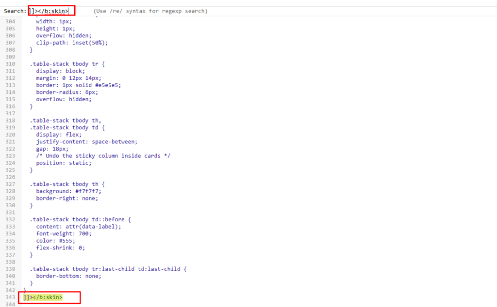
Back up your theme before you edit it. There’s no undo in that editor.
In the post, inside a style tag. Paste the CSS wrapped in <style> tags at the top of the post’s HTML view. Fine if you’ll only ever have one table. Bad if you’ll have twenty, because then you’re maintaining twenty copies and every one of them ships duplicate CSS to the reader.
Use the theme. It takes the same two minutes and you do it once.
Getting the HTML Into a Post
In the post editor, the pencil icon in the top left toggles between Compose view and HTML view. Switch to HTML view, find the spot, paste your table.
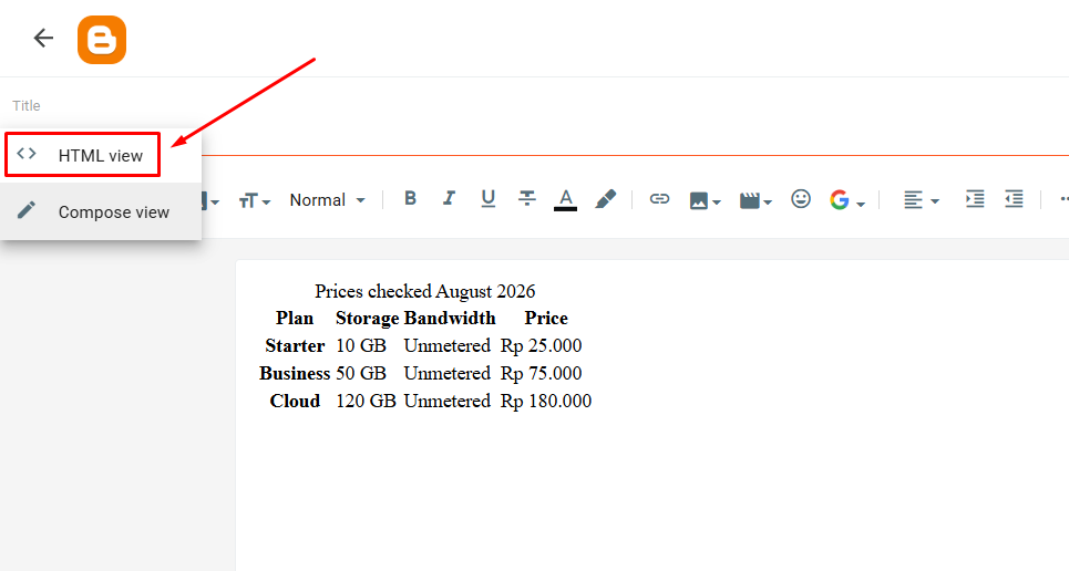
A trick that saves a lot of squinting: in Compose view, type TABLEHERE on its own line where you want the table. Then switch to HTML view and search for it. Much faster than scanning a wall of markup for the right paragraph.
Paste your table last, and publish without switching back to Compose. Blogger’s Compose view has a habit of reformatting markup it doesn’t recognise, and a table that looked perfect in HTML view can come back with stray line breaks scattered through it. If you need to keep editing the surrounding text, do that first and add the table at the end.
Picking the Right Shape
Every guide on this topic presents horizontal scroll as the responsive table solution. It’s one of several, and it isn’t always the right one.
| Your data | Use | Why |
|---|---|---|
| Numbers people compare across columns | Table 1 | Comparison needs the grid intact |
| Plans or packages with one you recommend | Table 2 | The highlight does the persuading |
| One product, many attributes | Table 3 | Two columns never need scrolling |
| Rows that stand alone, like a schedule | Table 4 | Cards read better than a grid |
| Feature availability across options | Table 5 | Marks scan faster than words |
Five Tables You Can Copy
All five run on the CSS above. Change the text, change the aria-label, and paste.
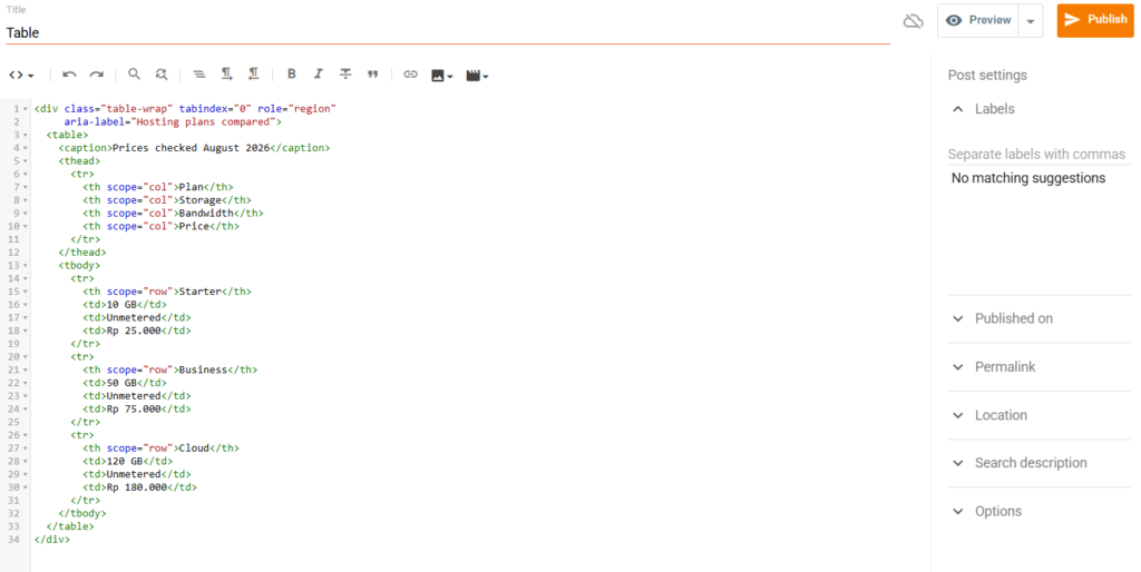
1. Comparison table
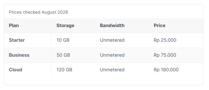
The workhorse. Scrolls sideways on a phone, first column stays put, header stays put.
<div class="table-wrap" tabindex="0" role="region"
     aria-label="Hosting plans compared">
  <table>
    <caption>Prices checked August 2026</caption>
    <thead>
      <tr>
        <th scope="col">Plan</th>
        <th scope="col">Storage</th>
        <th scope="col">Bandwidth</th>
        <th scope="col">Price</th>
      </tr>
    </thead>
    <tbody>
      <tr>
        <th scope="row">Starter</th>
        <td>10 GB</td>
        <td>Unmetered</td>
        <td>Rp 25.000</td>
      </tr>
      <tr>
        <th scope="row">Business</th>
        <td>50 GB</td>
        <td>Unmetered</td>
        <td>Rp 75.000</td>
      </tr>
      <tr>
        <th scope="row">Cloud</th>
        <td>120 GB</td>
        <td>Unmetered</td>
        <td>Rp 180.000</td>
      </tr>
    </tbody>
  </table>
</div>
2. Pricing table with a highlighted column
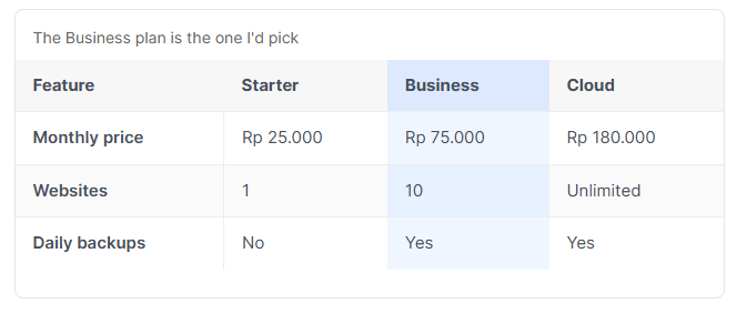
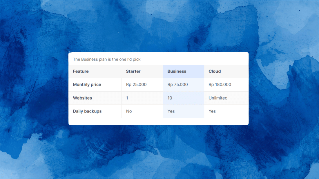
Same structure, with class="is-featured" on every cell in the column you’re recommending. The header cell too, or the tint stops halfway up.
<div class="table-wrap" tabindex="0" role="region"
     aria-label="Plan pricing, Business plan recommended">
  <table>
    <caption>The Business plan is the one I'd pick</caption>
    <thead>
      <tr>
        <th scope="col">Feature</th>
        <th scope="col">Starter</th>
        <th scope="col" class="is-featured">Business</th>
        <th scope="col">Cloud</th>
      </tr>
    </thead>
    <tbody>
      <tr>
        <th scope="row">Monthly price</th>
        <td>Rp 25.000</td>
        <td class="is-featured">Rp 75.000</td>
        <td>Rp 180.000</td>
      </tr>
      <tr>
        <th scope="row">Websites</th>
        <td>1</td>
        <td class="is-featured">10</td>
        <td>Unlimited</td>
      </tr>
      <tr>
        <th scope="row">Daily backups</th>
        <td>No</td>
        <td class="is-featured">Yes</td>
        <td>Yes</td>
      </tr>
    </tbody>
  </table>
</div>
The tint is decoration, so it carries no meaning for anyone who can’t see it. That’s why the recommendation is also written out in the caption.
3. Spec sheet
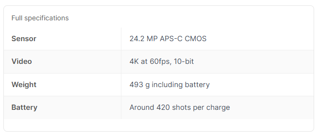
Two columns, one product. Add table-spec to the wrapper and the min-width is removed, so it fits any screen without scrolling. No thead here, because there are no column headings to write.
<div class="table-wrap table-spec" role="region"
     aria-label="Camera specifications">
  <table>
    <caption>Full specifications</caption>
    <tbody>
      <tr>
        <th scope="row">Sensor</th>
        <td>24.2 MP APS-C CMOS</td>
      </tr>
      <tr>
        <th scope="row">Video</th>
        <td>4K at 60fps, 10-bit</td>
      </tr>
      <tr>
        <th scope="row">Weight</th>
        <td>493 g including battery</td>
      </tr>
      <tr>
        <th scope="row">Battery</th>
        <td>Around 420 shots per charge</td>
      </tr>
    </tbody>
  </table>
</div>
No tabindex on this one, deliberately. Nothing scrolls, so there’s nothing for a keyboard user to do, and a focus stop that leads nowhere is just an obstacle.
4. Stacked cards on mobile
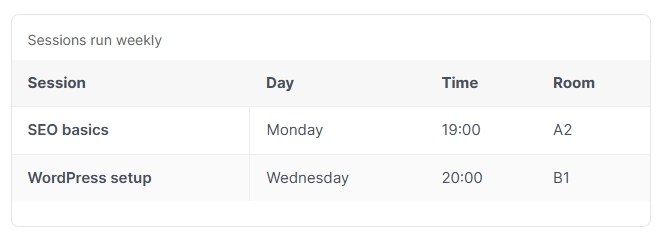
Add table-stack to the wrapper. Below 600px each row becomes a card with the column name printed beside each value. Every <td> needs a data-label matching its column.
<div class="table-wrap table-stack" tabindex="0" role="region"
     aria-label="Workshop schedule">
  <table>
    <caption>Sessions run weekly</caption>
    <thead>
      <tr>
        <th scope="col">Session</th>
        <th scope="col">Day</th>
        <th scope="col">Time</th>
        <th scope="col">Room</th>
      </tr>
    </thead>
    <tbody>
      <tr>
        <th scope="row">SEO basics</th>
        <td data-label="Day">Monday</td>
        <td data-label="Time">19:00</td>
        <td data-label="Room">A2</td>
      </tr>
      <tr>
        <th scope="row">WordPress setup</th>
        <td data-label="Day">Wednesday</td>
        <td data-label="Time">20:00</td>
        <td data-label="Room">B1</td>
      </tr>
    </tbody>
  </table>
</div>
Two honest drawbacks. The labels come from CSS content, so they aren’t included when a reader selects and copies the table. And every cell needs its data-label typed by hand, which on a table you edit often becomes a maintenance job.
Use it when rows stand alone. Don’t use it for anything people need to compare, because once the rows are stacked vertically, comparing them at a glance is exactly what you’ve made impossible.
5. Feature table with yes and no marks
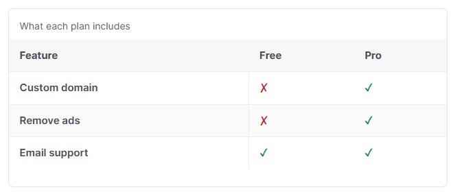
Ticks and crosses scan far faster than the words. There’s a catch, and it’s the reason this version has extra markup in it.
<div class="table-wrap" tabindex="0" role="region"
aria-label="Feature availability by plan">
<table>
<caption>What each plan includes</caption>
<thead>
<tr>
<th scope="col">Feature</th>
<th scope="col">Free</th>
<th scope="col">Pro</th>
</tr>
</thead>
<tbody>
<tr>
<th scope="row">Custom domain</th>
<td><span class="mark-no" aria-hidden="true">✗</span>
<span class="sr-only">Not included</span></td>
<td><span class="mark-yes" aria-hidden="true">✓</span>
<span class="sr-only">Included</span></td>
</tr>
<tr>
<th scope="row">Remove ads</th>
<td><span class="mark-no" aria-hidden="true">✗</span>
<span class="sr-only">Not included</span></td>
<td><span class="mark-yes" aria-hidden="true">✓</span>
<span class="sr-only">Included</span></td>
</tr>
<tr>
<th scope="row">Email support</th>
<td><span class="mark-yes" aria-hidden="true">✓</span>
<span class="sr-only">Included</span></td>
<td><span class="mark-yes" aria-hidden="true">✓</span>
<span class="sr-only">Included</span></td>
</tr>
</tbody>
</table>
</div>Here’s why it looks like that. A green tick is meaningless to a screen reader, which reads it as a check mark character or skips it entirely. So the symbol carries aria-hidden="true" and a hidden span next to it spells out the answer. The .sr-only class in the stylesheet keeps that text off the screen for everyone else.
Colour is doing work here too, so don’t rely on it alone. Green tick and red cross are different shapes as well as different colours, which is what makes it readable to someone with colour blindness.
The Google Docs Problem
A lot of guides suggest building your table in Google Docs or Word and pasting it in. It works, and it produces the worst HTML you will ever put on your blog.
What lands in your post looks roughly like this, on every single cell:
<td style="width:340px;border:1pt solid #000;padding:5pt;
vertical-align:top"><p dir="ltr" style="line-height:1.2;
margin-top:0pt;margin-bottom:0pt"><span style="font-size:11pt;
font-family:Arial;color:#000000">Rp 25.000</span></p></td>
Inline styles beat stylesheet rules, so that fixed width:340px overrides everything in your CSS. Your responsive wrapper is still there, still doing its job, and the table inside it refuses to move because every cell has been told exactly how wide to be. Then people conclude the responsive code doesn’t work.
If you must paste from Docs, strip the styles afterwards. Find and replace style="..." in a text editor, or run it through an HTML cleaner. Easier still, start from one of the five above and just change the text.
And whatever you do, don’t take the advice you’ll find on forums to screenshot your table and upload it as an image. Nobody can copy from it, nobody can search it, Google can’t read it, screen readers get nothing, and on a phone it’s a blurry rectangle. It solves the layout problem by removing the content.
You Can Ignore the AMP Advice
Some of the older tutorials on this topic are written around producing valid AMP HTML, which meant no inline styles, a hard CSS size budget, and various properties simply off the table.
That constraint is gone. Google dropped AMP as a requirement for the Top Stories carousel back in June 2021, and Blogger never officially supported AMP in the first place. Unless you’ve specifically converted your blog to AMP and know why, you’re writing plain HTML and CSS with no restrictions.
Which is why the stylesheet above uses position: sticky, clip-path and flexbox freely. A tutorial written under AMP rules in 2020 couldn’t, and that’s most of why those versions look more primitive than they need to.
Checking It Works
Five things, and the second one is the one people skip.
Narrow the browser window until it’s phone width. The table should scroll inside its box. If the whole page scrolls sideways instead, your wrapper isn’t applied or a parent element is forcing it out.
Put the mouse away. Press Tab until the table gets a focus outline, then press the right arrow key. It should scroll. If nothing happens, the tabindex is missing.
Scroll right on a phone and confirm the first column stays put.
Try to copy a row and paste it into a notes app. If you get a jumble, something in your CSS is fighting text selection.
Check a post that has no table after editing your theme. It’s easy to break a closing brace in the CSS and take the rest of the stylesheet down with it, and you won’t notice on the page you were testing.
When It Doesn’t Look Right
The table ignores your CSS entirely. Inline styles from a paste, almost certainly. Look at the HTML view and check whether every cell has a style= attribute on it.
Nothing scrolls, columns just get thinner. The min-width on the table is missing, or you left table-spec on the wrapper by mistake.
The sticky column is transparent. It needs its own background colour, and so does the striped version of it.
Sticky does nothing at all. Some themes put overflow: hidden on a parent container, which disables sticky positioning inside it. Inspect the ancestors of your table and look for it.
The stacked version shows no labels. The data-label attributes are missing from the <td> cells, or you forgot the table-stack class on the wrapper.
Your theme’s own table styles are fighting yours. Some Blogger themes ship their own table CSS. Either make your selectors more specific, or find and remove the theme’s version. If you swapped in a downloaded theme recently, that’s the likely source.
Everything broke after editing the theme. Restore your backup and try again more carefully. This is the reason the backup step isn’t optional.
The Short Version
Paste the stylesheet into your theme once. Pick whichever of the five tables matches your data. Change the text and the aria-label. Keep the caption, the scope attributes and the tabindex, because those three things cost nothing and are the difference between a table that works for everyone and one that doesn’t.
WordPress hands you a table block and you never think about any of this, which is one of the honest trade-offs we went through in Blogger vs WordPress. On Blogger you do it yourself, once, and then it works on every post you ever write.
Twenty minutes of setup. Then never again.